The more I use Evernote the more I am convinced it will be a good replacement for (some of) my use of desktop folders to organize materials. However, my experiments this past week with FlipBoard as a tool to share content with my students had some snags.
I love the appearance of a FlipBoard magazine. It looks professional and modern and works well on desktop and mobile platforms. The links are clickable. The embedded videos show the visual of the video (that's good) and then take you to YouTube (I'd rather stay in the magazine) to view the video when you click on the visual. I can "add a caption" but that caption is a single paragraph with little formatting. In order to post an article that I have created I must link to its website (a wiki, in most cases). If I must link to another site--and if I like that site--then why am I using FlipBoard? So... I see good reasons to use FlipBoard, but I do not see it as the best way to share my content (web articles and my own content) with my students.
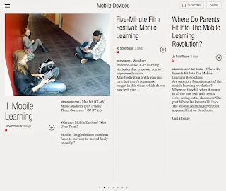 | ||||||||||
| FlipBoard: Mobile Learning by (and used with permission of) Jo Schiffbauer |
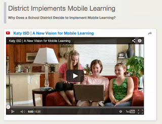 |
| BagTheWeb: Mobile Learning by (and used with permission of) Jo Schiffbauer |
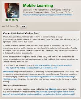 |
| BagTheWeb: Mobile Learning by (and used with permission of) Jo Schiffbauer |
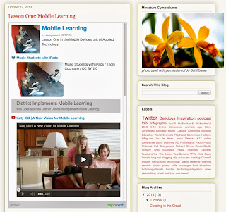 |
| BagTheWeb: Mobile Learning by (and used with permission of) Jo Schiffbauer embedded in Blogger |
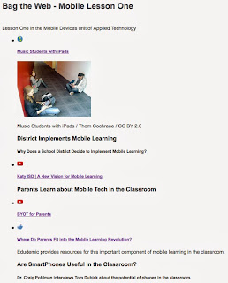 |
| BagTheWeb: Mobile Learning by (and used with permission of) Jo Schiffbauer embedded in Google Sites |
Today I tried Evernote for sharing content with the students. I captured my website with a web clipping. Links are clickable. Videos are not embedded. And because I'm simply clipping my website why am I using Evernote for this process?
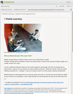 |
| Evernote: Mobile Learning notebook by (and used with permission of) Jo Schiffbauer |
I also tried LiveBinders this past week. LiveBinders allows clickable links, embedded videos, and formatting your own content. I think LiveBinders looks cluttered when there are lots of tabs. But, it will be a while before I'm at that point.
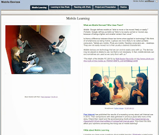 |
| LiveBinders: Mobile Learning by (and used with permission of) Jo Schiffbauer |
Here's how my lesson looks in Google Sites (my wiki)... clickable links, embedded videos, and formatted content.
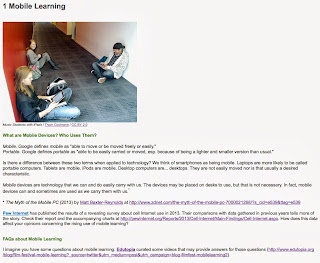 |
| Google Sites: Mobile Learning by (and used with permission of) Jo Schiffbauer |
Conclusion? My favorite is Google Sites. I'm sure that part of the reason is because I have used it for so long that I'm comfortable with its features. But, I do like its features, including many that I have not listed in this post.
However, I am looking for an alternate method for sharing content that is separate from the organization structure I use for my classes. I could have my class wiki link to a content wiki... or I could use LiveBinders for the content. I think I will try LiveBinders to help me decide if I really do want the content separate from the organization structure.
So... my curation tools will now be Evernote (so I can curate in the cloud rather than just on my desktop computer at home), Delicious (to keep track of and to share websites), and LiveBinders (to share content).
I'll see how this works... or if there will be a need for a re-revisit. : )
No comments:
Post a Comment